In this blogpost, I take you along five tips to improve your data stories. You can leverage these tips when drafting reports, presentations and designing dashboards. I apply these in all of my data communications.
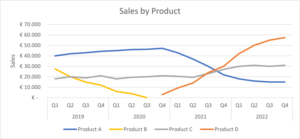
Throughout this blogpost, we will use the following case: “You work at the sales department and are asked to provide insight in the sales of several products over the past years. The following graph (basic Excel graph without any editing) provides a first insight in the data. We will use this graph and edit it towards a better data story.
Tip 1. Be aware of the context
A good data story starts by understanding the context in which the data (and its visualizations) will be interpreted. Being aware of who will see the visualization will to a large extent influence the way the visualization should be built. The following questions may help you better understand the context and draft a better data story.
- Who is your audience?
Depending on who your audience is, you can better understand how much granularity is needed in your communication. Are you talking to a management team who want to see big picture trends, or are you performing a deep dive into a specific topic? These two cases may require a completely different approach in terms of visualizing data, facilitating discussion on the right level of detail. Moreover, thinking about who is the ultimate decision maker for your data story and making the story specific to the decision at hand, may help guide the discussion. This also helps in formulating the goal for your communication. - What should your audience know or do?
The goal of the communication can range from a proposed action (e.g., we should market Product D more, because …) to a suggested discussion (e.g., let’s think about how we can increase sales in Product C). It can also be purely for information purposes. - How will you communicate with your audience?
The way in which you will communicate with your audience determines several facets of your communication, which may take the form of a live presentation, a written report or something in between. One of the most important facets is how much detail should be included. In a live presentation, you can suffice with a higher-level visualization for which you provide context and detail. In a written report, you are not there to do so, and the visual should be self-explanatory. In such cases, it is recommendable to provide more (written) context and detail where needed.
In our case
We can think of several types of audience for our data. The CEO might want to know how we are doing across the board, and whether we have been able to fill the gap after decommissioning Product B, and the sales manager might want to know whether there are ways to increase sales further by targeted action. In the following, we will focus on the sales manager. She is the one to determine the growth opportunities for next year. The visual should be self-explanatory, as if it is in a report, so the context is required.
Tip 2. Choose an effective visual
Every type of data has its preferred set of visualizations. A line graph is a good choice for data with a time component, but the same graph type may be less suited when comparing across categories. There is a broad range of visualizations that you can use, and not one visual is always better than others. Another consideration at this stage is to engage and/or to inform. A certain setting may require straightforward visuals, as they are merely focused on sharing information. Some other situation may want to invite the reader to dive into the visual and engage with it, discovering personally relevant insights.
In our case
We are using a time component, so a line chart is a good starting point. Moreover, we are focused on sharing information directly. We will change the standard Excel graph to better fit our data story in the following tips.
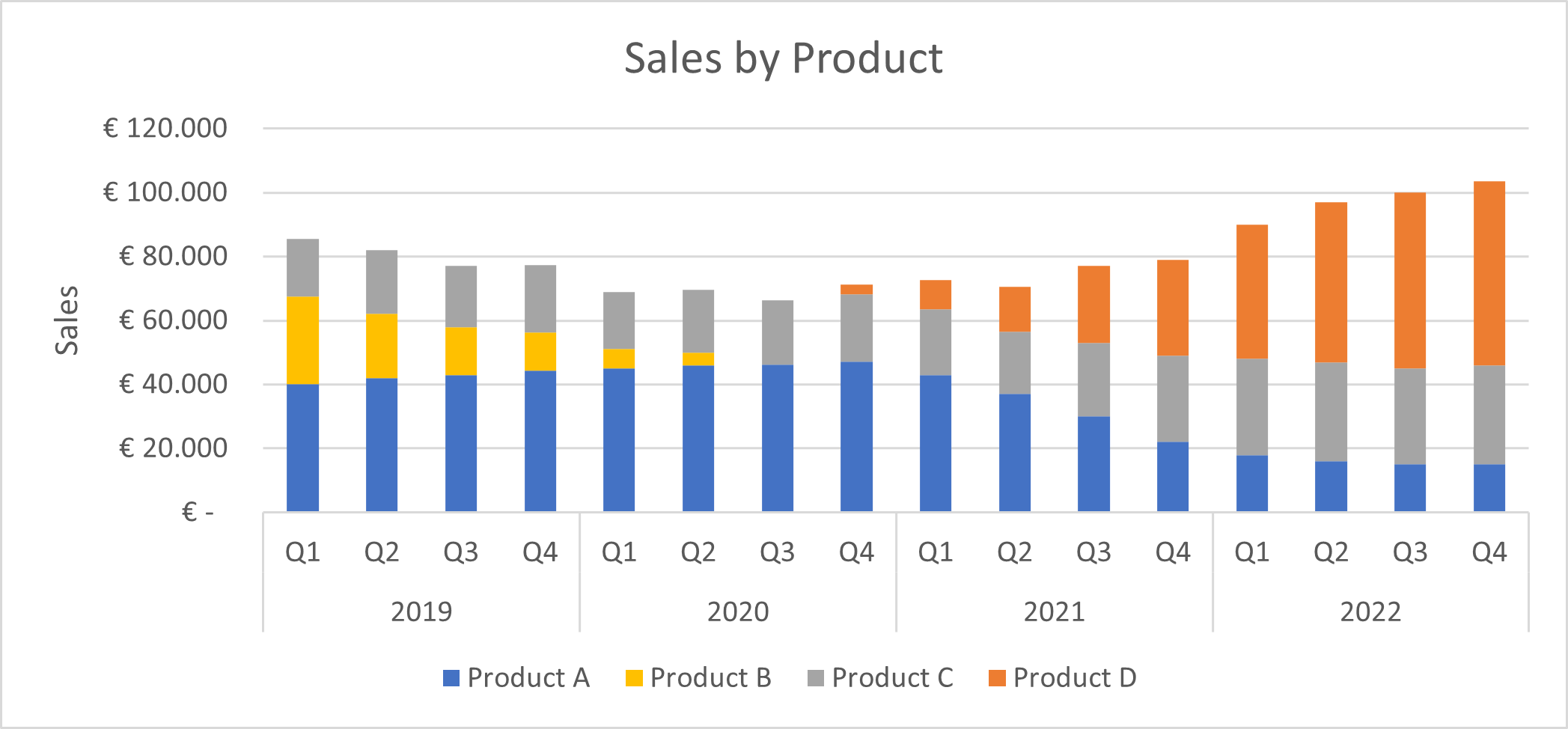
To illustrate how other graphs can be informative in other settings, consider the following graph. To answer our CEO’s question (“Did we recover from the dip that was a result of decommissioning Product B?”) we could use a stacked bar chart.
Tip 3. Tidy up
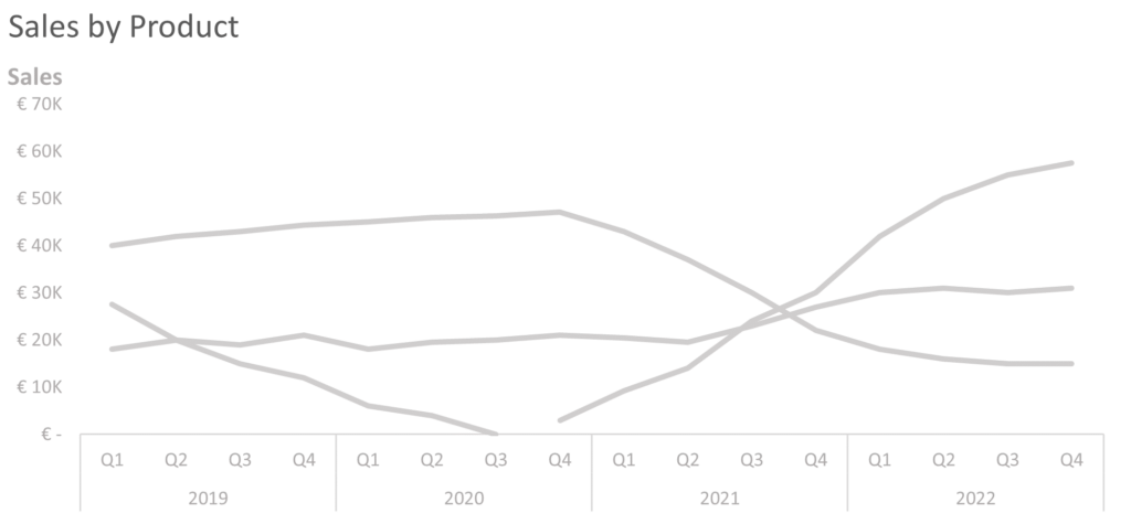
After selecting a proper graph type for your data and created the visual, it is time to remove any unnecessary elements from the graph that generally come with software packages (such as Excel), and provide space to what really matters: your data. Many elements in standard graphs lead to unnecessary cognitive load, making it harder for the reader to uncover the information shared through the visualization. Examples are: the colorful spaghetti in the line chart, the frame of the graph, grid lines, and large axis titles and labels, which sometimes can even be rotated. All of these take away attention from what should grab it: the display of data.
Actions that you can take here to clean up the graph are:
- Adjust the coloring of all datapoints to gray, forcing all elements to the background. Don’t worry, we will color them in again in the next tip.
- Remove any unnecessary elements such as the graph frame and grid lines. By moving the graph title to the upper left, you create a mental frame around the graph. In some cases, including grid lines may be preferred. However, in many cases there are better, less burdensome ways to achieve the same.
- Replace the Y-axis title to above the axis and write it horizontally. Research by Wigdor and Balakrishnan (2005) has provided evidence that a 45 degree angle reduces reading speed by 52%, and by 90 degrees even by 205%.
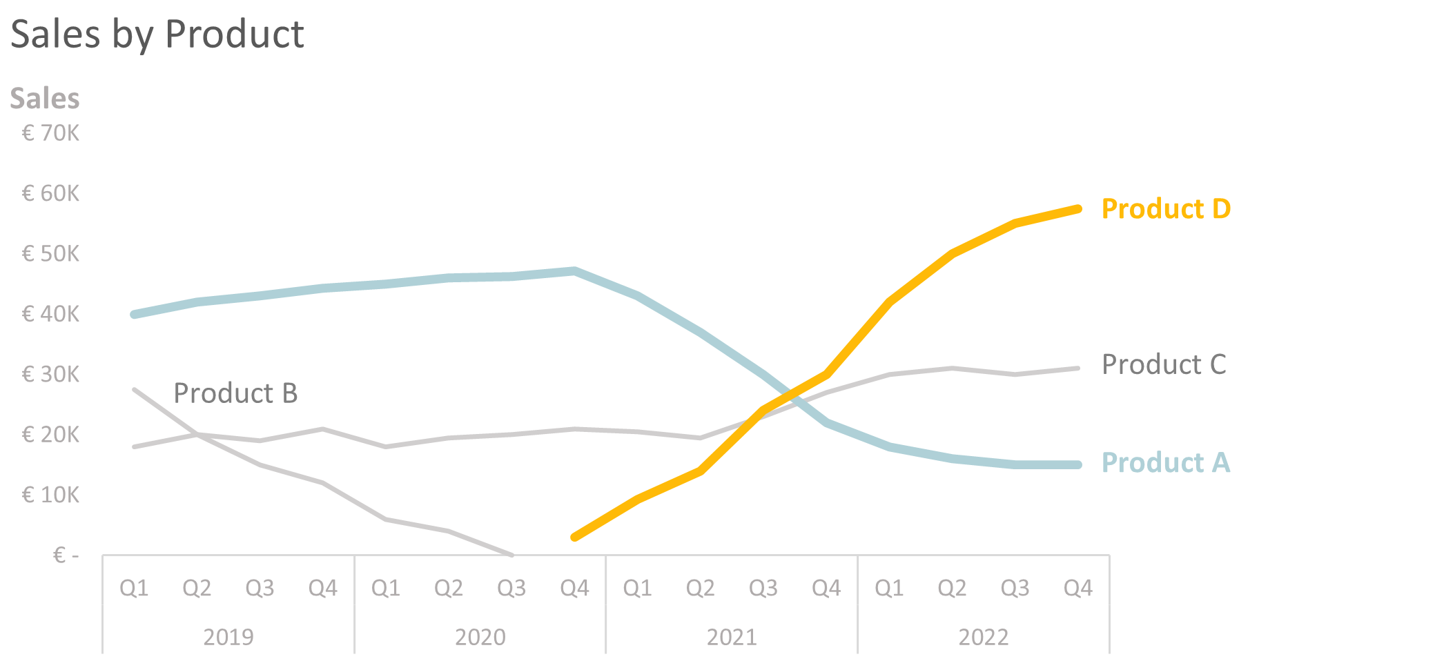
In our case
After performing these steps, here is what our graph looks like.
From here, we want to start creating our story.
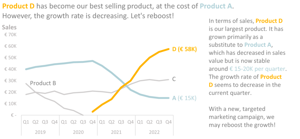
Tip 4. Bring focus
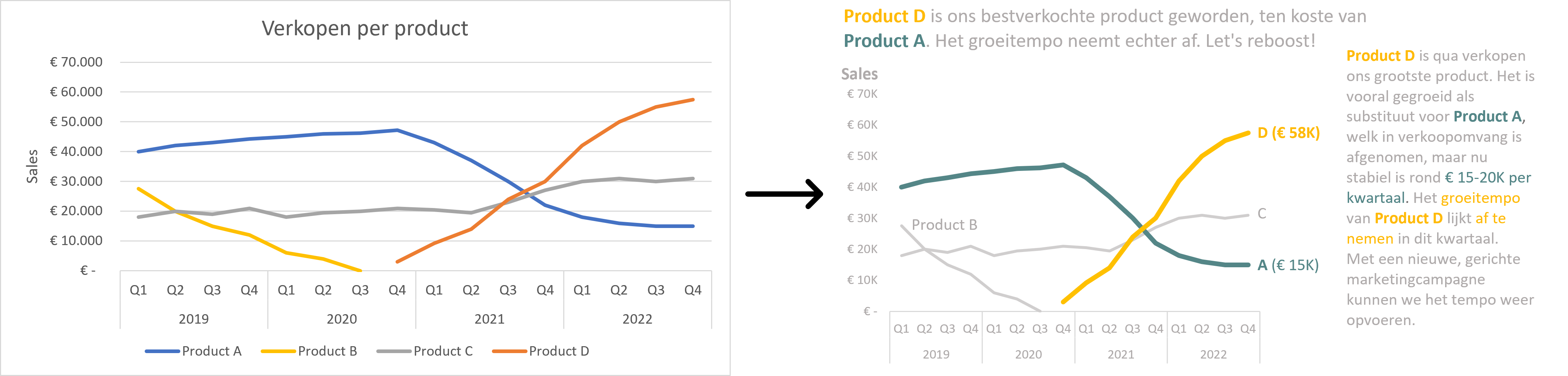
The result of tidying up the graph does not yet tell a story. It doesn’t even show which line is linked to which product. So if anything, we have made it worse at this point. In this step, we change that by deliberate use of color and other ways to focus attention. You can focus attention through color, bold text, line thickness, or a combination of these. In the graph below, you can now see clearly which are the lines we want to build our communication around. The legend is back, but now via direct annotation. Coloring the annotated text strengthens the association between the line and the label.
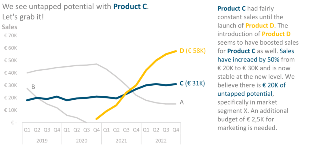
Tip 5. Tell a story
Once you have brought focus, the last tip covers the storytelling. By slightly resizing the graph, you can build in room for commentary, adding in the relevant context and takeaways. Below are two examples of this applied to our case.
Whitespace en annotation
An important part of telling a data story is the creation of whitespace and use of annotation. Creating whitespace lowers the cognitive load, helping the reader focus on the main story.
Annotation and the use of color in them can help the reader better understand and read the visualization. It can help gauge ratios and relationships between variables through text. Using color can create clear associations between the subject of the text and the graph.
In summary
In this blog, you learned about how to make data come to live. It all starts with understanding the context, choosing the right visualization, tidying up of unnecessary chart elements, focusing attention and telling a story.
This blog was inspired by the lessons from the book ‘Storytelling with Data’ by Cole Nussbaumer Knaflic.
Comments are closed