
The Gestalt principles of proximity, similarity, connectedness, enclosure, closure and continuity will help you turn hard-to-interpret visuals into cohesive and easy-to-understand ones!

As a volunteer for Viz for Social Good, I helped the NGO "Video Volunteers", an organization helping Indian community members address issues to their governments, tell stories with their data.
Starting your visualizations with gray helps improve your data story in several ways. In this blog, I discuss three of those.
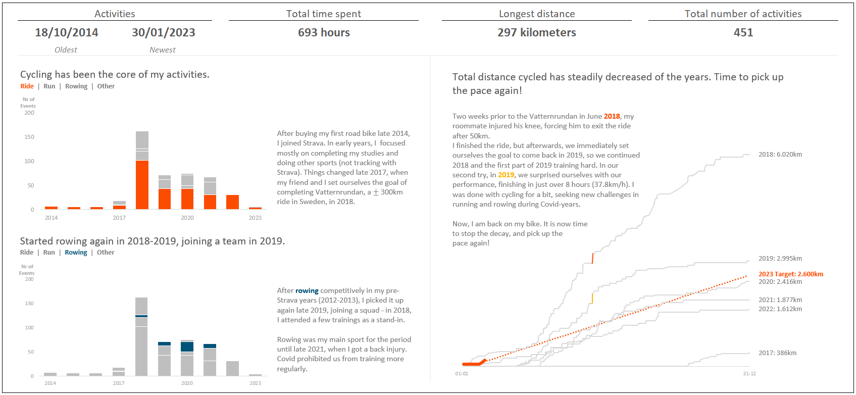
Practice makes perfect. In this blog, I discuss the value of iteration and how I constantly try to improve my data storytelling skills. In this blog, I discuss my entry to SWD's challenge of January 2023 on the Quantified Self.
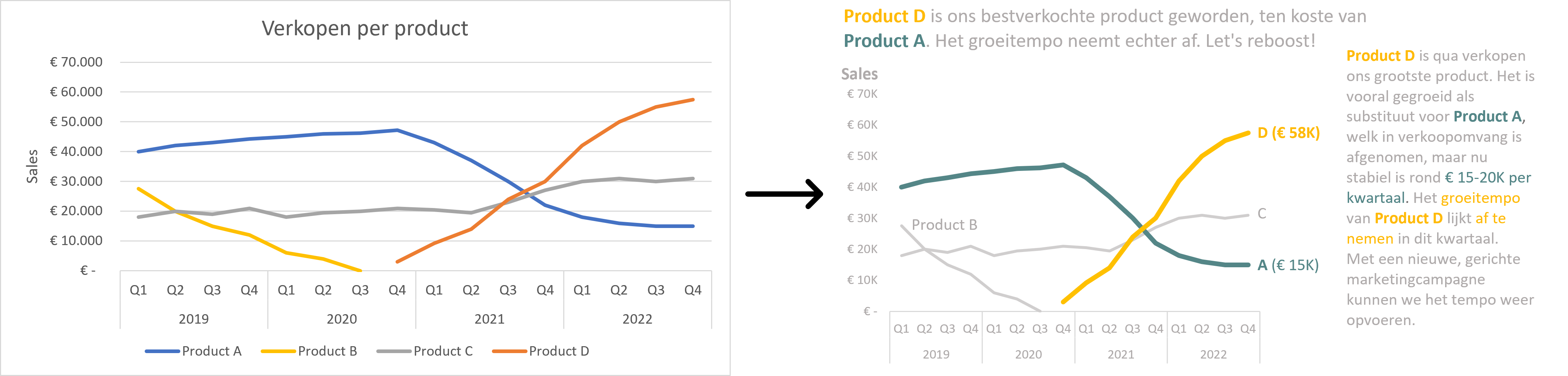
In this blog, I present 5 easy ways to improve your data story. In short: Start with your audience in mind, choose the right type of visual, tidy up, focus attention and tell a story.