
A bit of theory for better data visualizations
There are several theoretical concepts that are relevant to data visualization. One of these concepts stems from the Gestalt school of thought in psychology, and it is called the Gestalt Principles.
Researched and developed by a group of German scientists in the early 20th century, the gestalt principles refer to the idea that understanding the whole of something is often more important or convenient than understanding its individual components. To make it a bit more tangible: consider a flock of birds. We tend to group them and think of the group as one flock, instead of the hundreds of individual birds the flock may contain.
In this blog, I discuss the six most relevant principles when it comes to data visualization.
Some of these concepts will feel very natural – at least that is how I felt when I first learned about them. You may have been applying these concepts without even knowing that these principles exist. Others may feel less natural. In any case, I hope this blog helps you put these concepts into perspective and helps you create more cohesive, easy-to-interpret visuals and dashboards.
In my training on data visualization and data storytelling, we dive deep into the application of these principles, and how we can leverage each of them when we go about creating graphs and dashboards and crafting our data stories. Find out more about the training here.
The principles discussed in this blog are:
- Proximity
- Similarity
- Connectedness
- Enclosure
- Closure
- Continuity
Before we dive into each of them though, let’s start of by discussing the concept of associative power.
Associative power
Associative power is the degree to which we ‘feel’ that elements are connected or related to each other. This power can be stronger or weaker, depending on how you design your graph and choose which principles to apply. You can even create a hierarchy for grouping elements, using the principles outlined below to guide the reader which groups are most important, and which are less important. I highlight some considerations regarding associative power in the discussion of some of the principles below.
1. Proximity
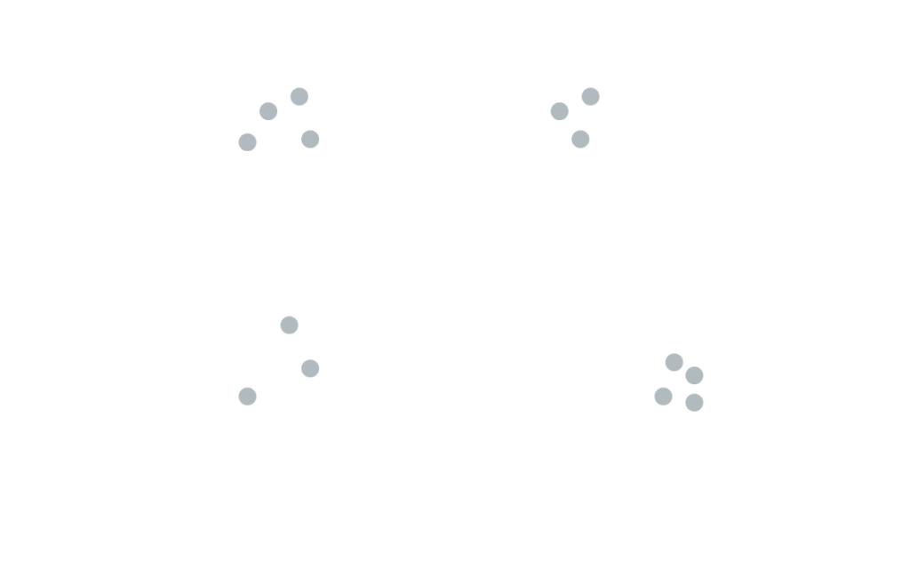
The first principle is proximity, which reflects our tendency to group objects together that are close to each other as belonging to a single group. We automatically see four groups appear in the scatter plot in Figure 1, without knowing anything about the context. This concept also applies to dashboarding: we tend to think that graphs and visual elements that are near each other (for example, a section with several KPI trackers) can be grouped together (section: “KPIs”).
2. Similarity
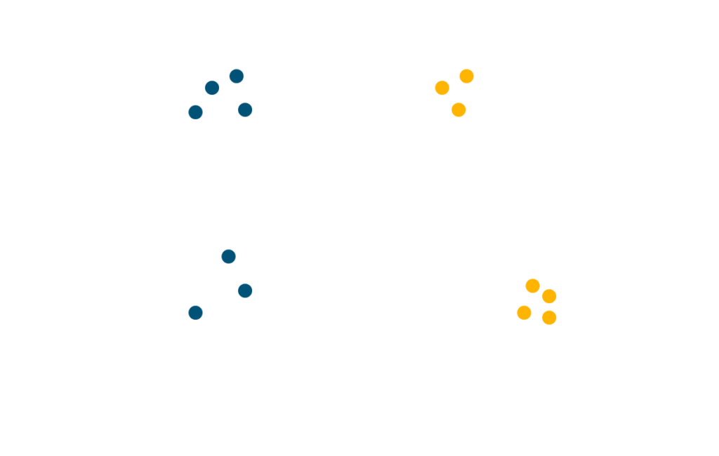
The principle of similarity refers to our tendency to group objects that share color, orientation, shape or size as a single group. Applied to our example from before, we can now also see – besides the four groups we identified based on proximity – two groups based on color (blue and yellow), and one group (containing all elements) based on shape and size (they are all dots and equal in size).
This means that in this one – apparently simple – visual, we can already see 7 different groupings of the data. Some of these groupings are more prevalent than others (they have higher associative power), so our brain creates a form of hierarchy. In our example, the color separation between the two groups weighs heavier than the groups based on proximity. The grouping based on shape/size adds very little value and is therefore at the bottom of the hierarchy in this case.
3. Connectedness
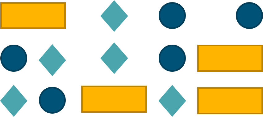
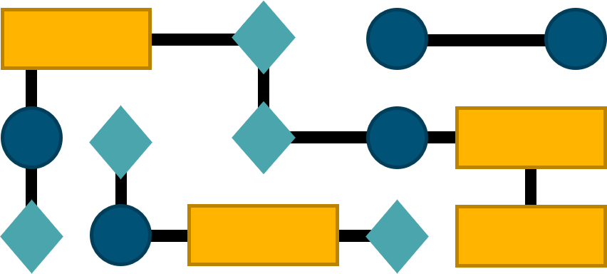
Connectedness reflects our tendency to group objects that are connected to one another as a single group. A prime example is a line chart, in which the different elements of one series are connected through a line, but its application is broader than only graphs. Flow diagrams, with arrows connecting different flow steps indicating the flow of elements and the direction are an example too. Connectedness generally has a stronger associative power than proximity and similarity. This means that, although some elements may be closer to each other or share characteristics such as color, shape or size, the connection with other elements will be more prevalent. Let’s look at an example.
In the picture on the top, you can see some elements that can be grouped in three based on similarity (shape + color) or through proximity (left 5 elements, middle 3, right 6). In the picture on the right thought, there are still three groups, but you will probably find yourself grouping them according to their connection and no longer through their shared characteristics or location.
4. Enclosure
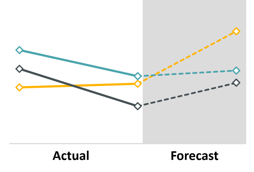
The principle of enclosure denotes our tendency to group physically enclosed objects as belonging to one group. This has applications in graph and dashboard design. A common example in graph design is to shade one area of the graph to indicate that it is different from the other part or parts – for instance separating known actuals from unknown forecasts. An example in dashboard design is to visually demarcate sections. For instance, having some KPI trackers on the top and graphs with details on the bottom, these sections could be enclosed to visually reinforce that they are different, but that elements within each section share certain traits.
5. Closure
Closure describes our tendency to ignore gaps and complete structures with open endings. That is, we don’t see 54 black shapes (I counted ;-)) on a white background, but a tiger. Applied to our graph design, we can be thoughtful on where we place titles and axis labels so to create a natural border around the graph, instead of the default chart border that many spreadsheet tools (like Excel) have.

6. Continuity
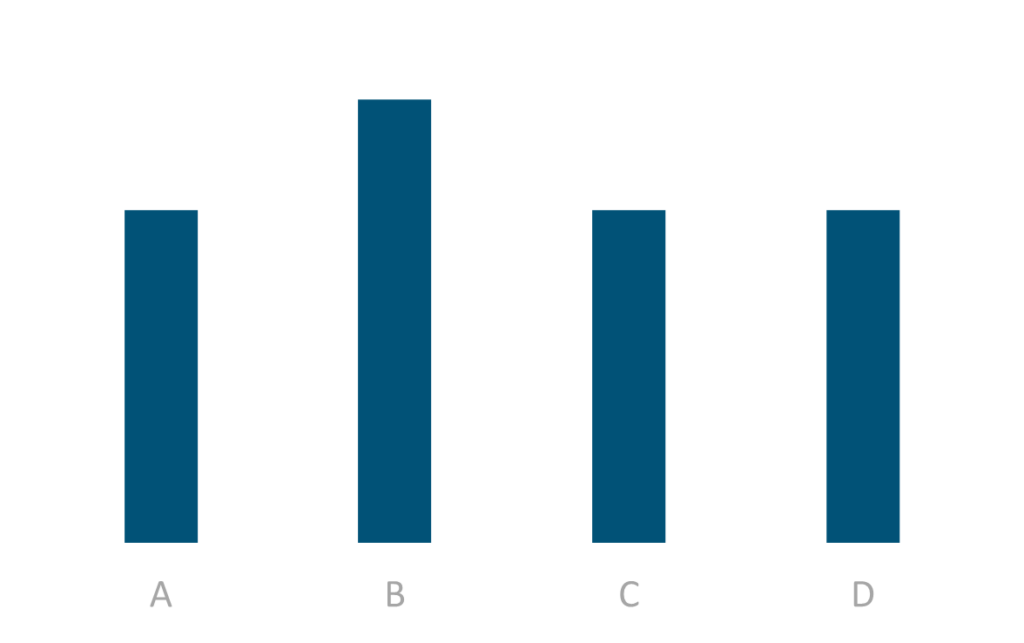
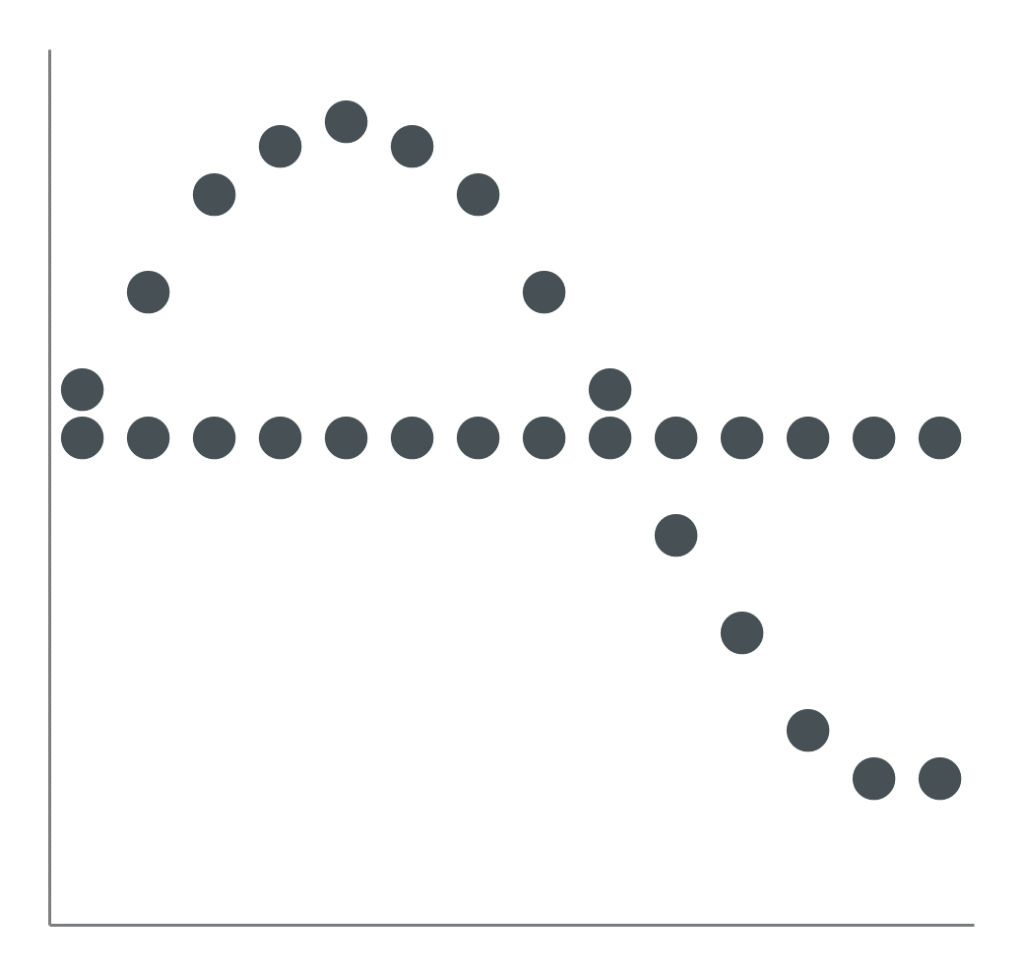
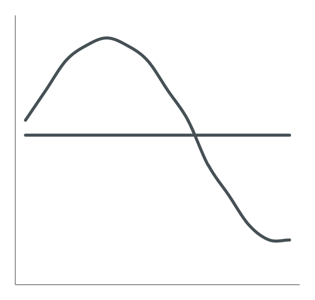
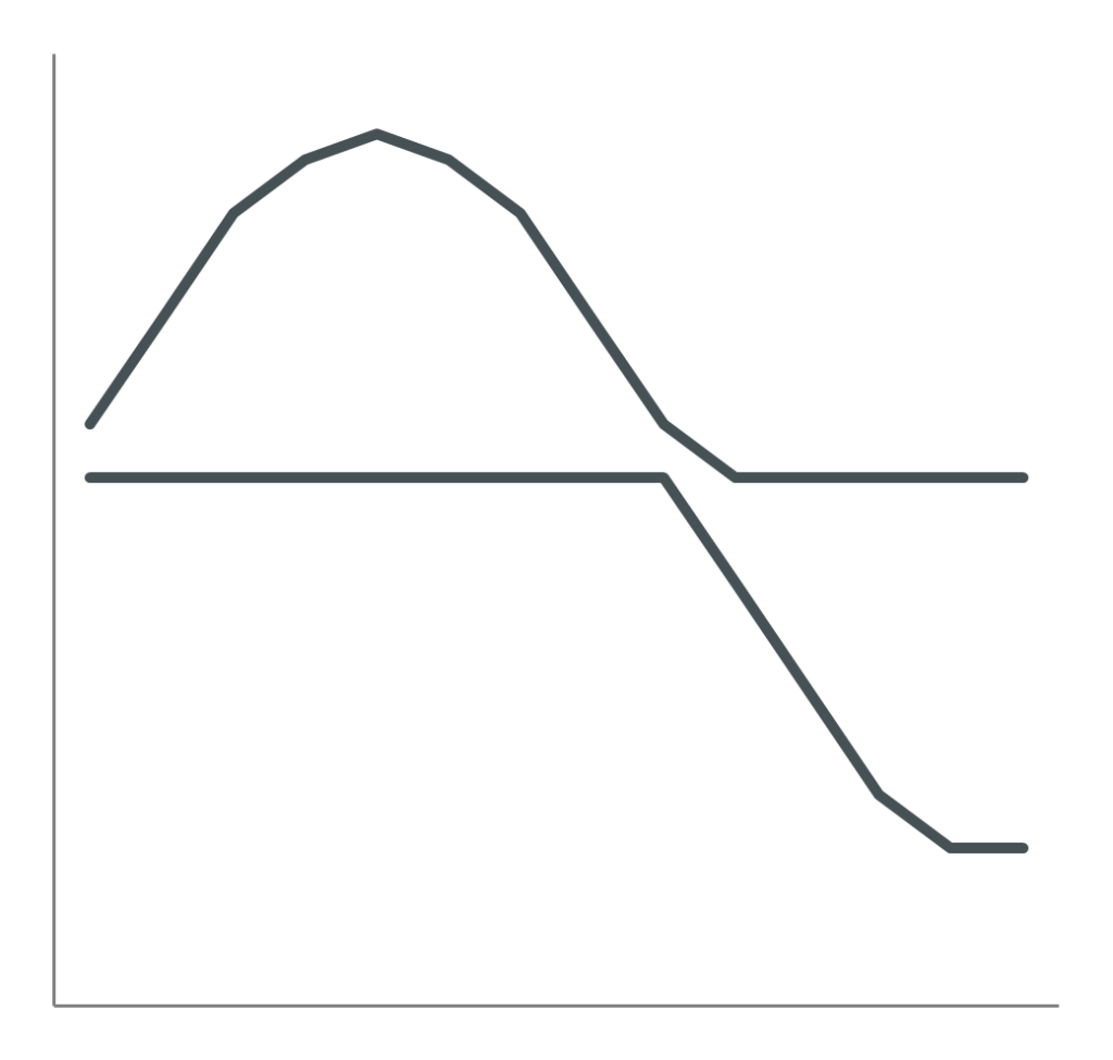
Continuity refers to our tendency to group together objects that are aligned or that continue one another. Applied to data visualization, this implies that we will assume that the bars in the following example will start at the exact same baseline, even though the baseline itself was stripped from the graph. This also implies that we will tend to think that the markers as presented in Figure 6b – 1 will continue as presented in 2, and not as presented in 3.
With the knowledge of these principles, you now have the power to turn hard-to-interpret visuals into something cohesive, clear and easy-to-understand.
Want to learn more?
Visit the Trainings page and find out how I can help you master these principles and apply them in your work!
Comments are closed