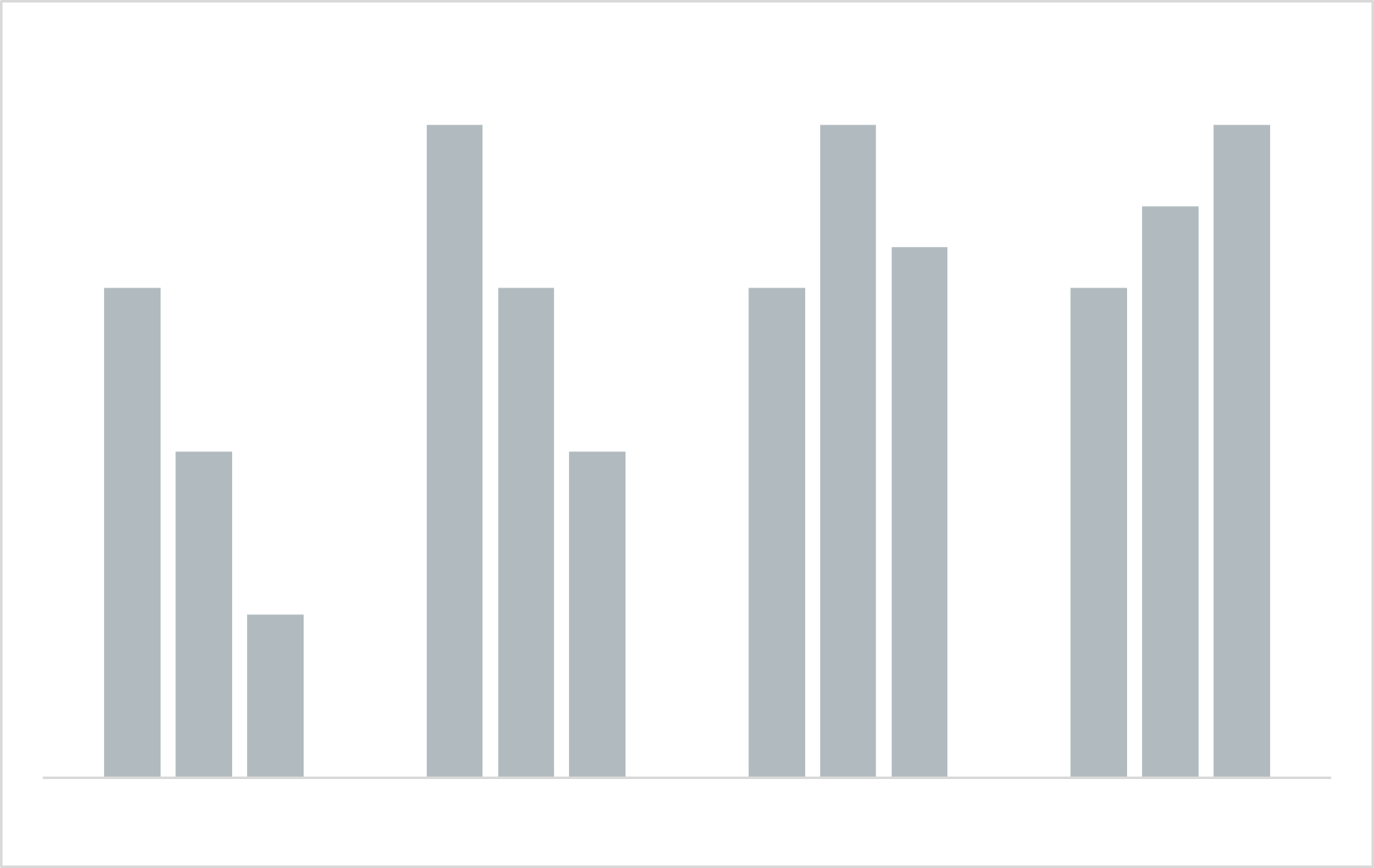
In tip 3. Tidy Up from my first blog (5 tips to make your data come alive), I suggested to adjust the coloring of data points to gray and push them to the background. In this blog, I explain in three ways why it is a good idea to start your visualizations with gray.
1. It forces you to think about the story behind the graph.
Pushing everything to the background forces you to think about the point you want to make. Why is the graph needed in the first place? And what story should it convey? Starting with gray invites you to answer these questions, which in turn helps you improve your ability to explain the data story presented in the graph.
2. It allows optimal use of pre-attentive features.
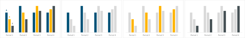
Through the use of a single, non-attention grabbing color such as gray, you create a calm environment for the readers and their eyes. By then making thoughtful use of (highlighting) color, you can optimally use the human’s visual system’s object detection features (the so-called pre-attentive features). Originally designed to detect objects and shifts in patterns to prepare for fight or flight, these features are now a data visualizers best friend to focus attention. By being thoughtful on the color and leaving the rest as gray, you can leverage some these features optimally.
3. It makes your graph more versatile.
By having a gray version of the graph as a sort of template, you can then use that to tell different stories, e.g., in a presentation. An example storyline could be that you show the final graph first and describe the context and axes, and then in subsequent slides focus the story on what is visible in each of the categories. Coloring one graph in each slide allows you to focus attention on only that part of the whole, while leaving the other parts in as context.
In this blog, I provided three reasons to start a data visualization exercise with gray. Do you have a similar approach, or a different one? Let me know your approach in the comments below.
Comments are closed