My dive into the area of data storytelling has been exciting so far. Over the past months, I have read several books on building better graphs, dashboards and data communication in general. It is even more exciting to bring the lessons I have learned (and shared in this blogpost) into practice. There are many ways to practice, but it is nicer to have it linked to a certain goal. This time around, I joined the Storytelling with Data (SWD) monthly challenge for January, which was focused around the Quantified Self. This meant that you had to look at yourself in some quantified way. I had the goal of analyzing my Strava data for some time already, and decided that this challenge was a nice way to combine the two. I downloaded my Strava history and got started.
Preparing the data
The first part of the exercise concerned preparing the data for visualizing. I had the idea to have a graph where each line shows the cumulative distance for the year by date. This meant that I had to get creative in the data preparation in order to properly prepare it for visualization. This included creating a new column with the day and month of each event, but with a preset year (so that the mapping could be done from Jan-1 to Dec-31, instead of a time series crossing many years), and calculating a cumulative sum column for the distance. It further involved creating multiple slices of the data to prepare it for the different types of visualization I was going to use.
Building the dashboard
Most of the ideas around what I wanted to show came up during a walk two weeks ago. I pictured the cumulative graph, together with a few graphs related to transitions between sports (as I switched from mostly cycling to more rowing and running in 2019), and then maybe a few callouts mentioning total distance, total hours. By the time I had prepared the data, the only thing that had to be done was to figure out how to position each element on the dashboard. As the graphs are connected through the story, it is important that the reader follows that storyline when reading the dashboard.
Iteration is key
One of the pros of participating in challenges such as these, is that the people at SWD chime in to provide feedback. I also posted about my participation on LinkedIn, which resulted in some colleagues and friends providing their feedback as well. I used this feedback to iterate and improve the dashboard.
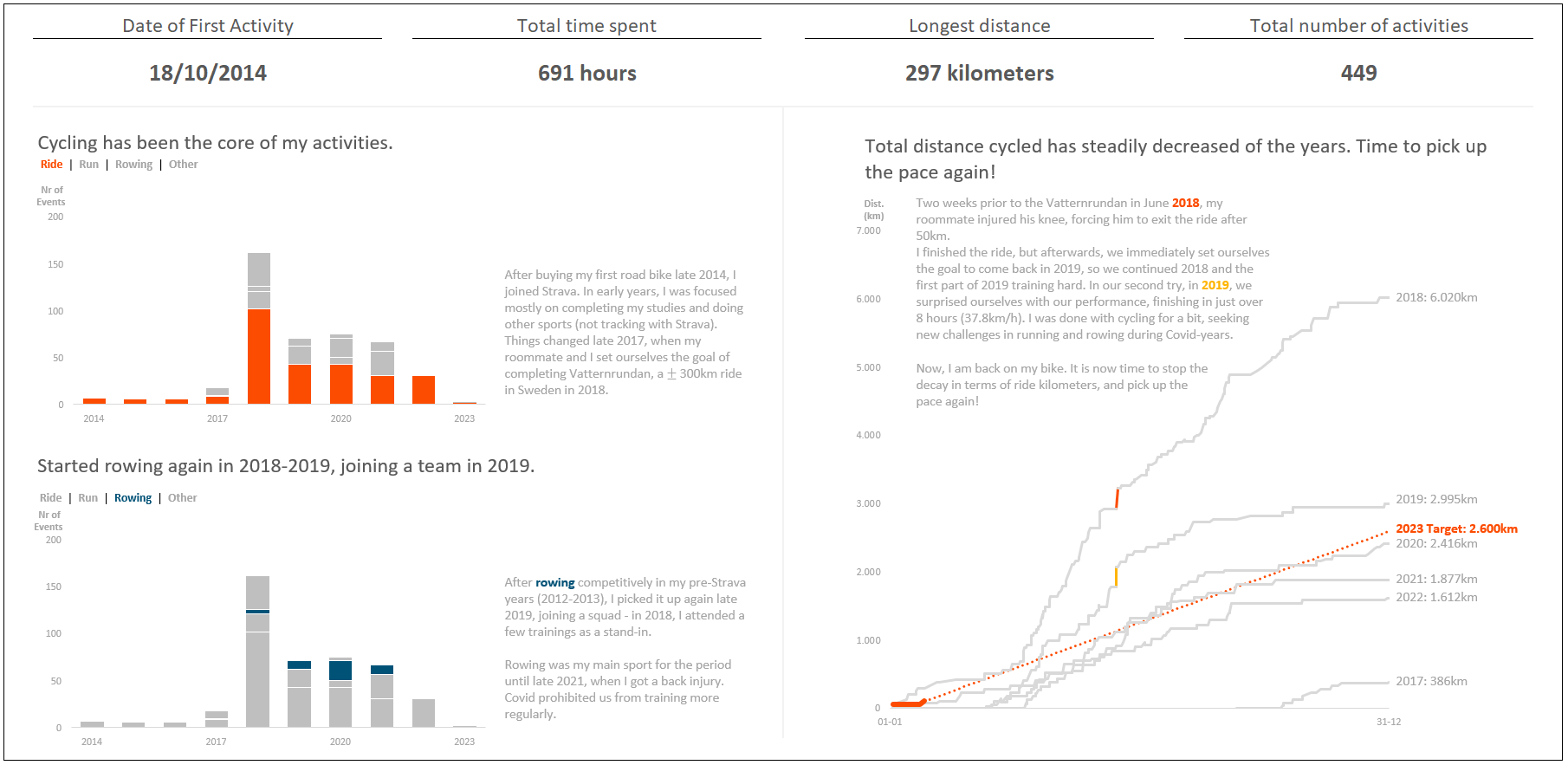
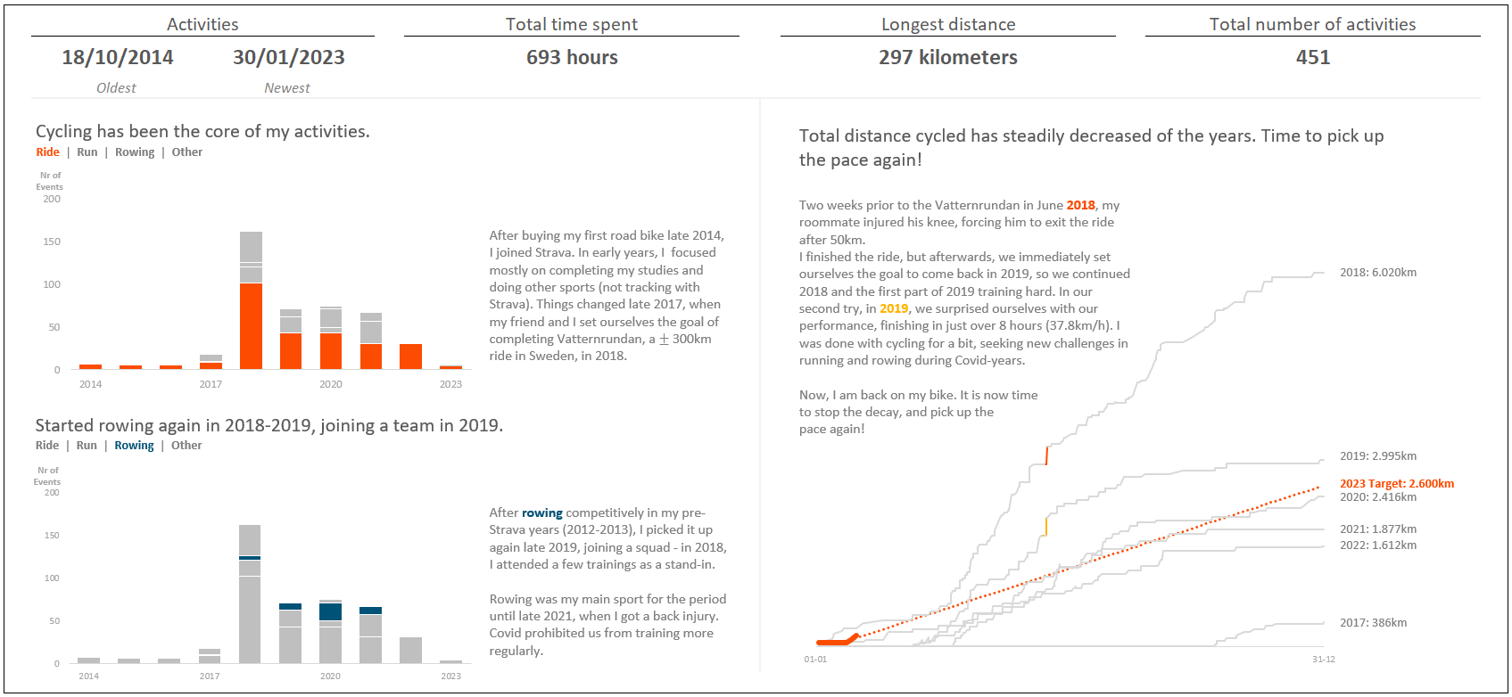
Can you spot the difference between my first submission (above) and the final iteration (answer below)?

The differences are mostly subtle (increase font size of text, shade it darker for better contrast), but there are some bigger ones, e.g., removing the y-axis from the right graph, as the data was already labeled directly, and the introduction of the callout of the most recent activity. Part of the feedback I received was to reorder the left-bottom graph so that the rowing items were aligned to the bottom, enabling better comparison between years. However, I chose to leave them in the same place as they are in the top graph, so that the reader does not have to recalibrate. The tradeoff I made here was the ease of reading the graph at the cost of better comparison across years for rowing. It was not my intention to show precisely how many times I rowed in those years, more a general pattern towards the sport. This tradeoff reminds me of a phrase in the book The Big Book of Dashboards by Steve Wexler, Jeffrey Shaffer and Andy Cotgreave: “Every decision is a compromise. However you choose to show your data, you will emphasize one feature over another.” This is a clear example of such a compromise.
Though these changes may seem relatively minor, it is exactly these points of feedback that help me improve my data storytelling skills.
Takeaways
This challenge proved once again to me the value of iterating and seeking feedback. Participating in challenges like these is not only fun, it also helps you grow. I especially liked this challenge because I could bring two parts together that I enjoy a lot: sports & data.
Comments are closed