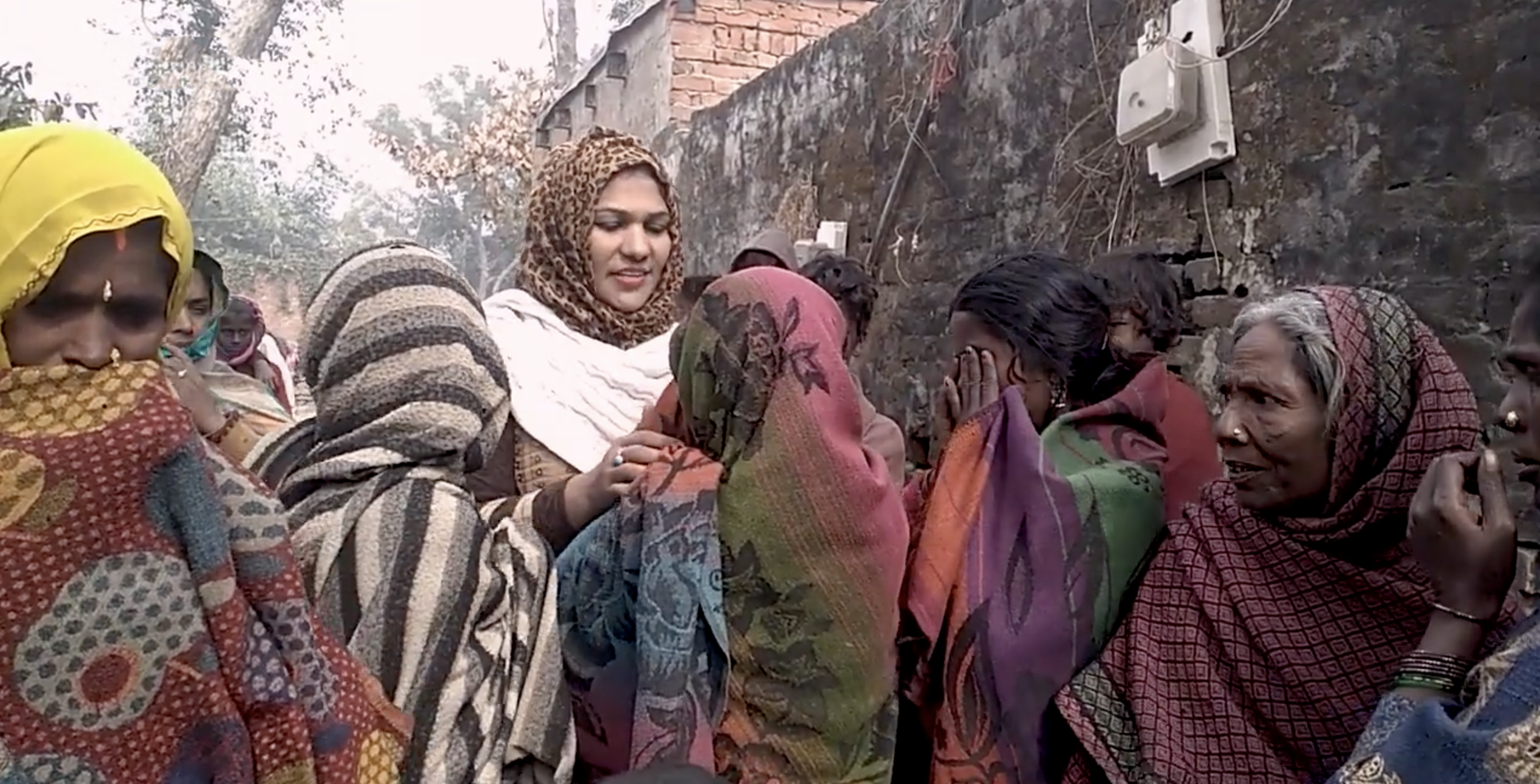
These weeks, I have worked on a project for the India-based NGO called Video Volunteers, an organization focused on giving marginalized communities and citizens a voice and enabling them to address issues to their governments through video. I got involved in this project as a volunteer of Viz for Social Good. In this blog, I walk you through the project and the lessons learned.
The project
Let’s start off with the end result. Below, you see the landing page and the first detail page (after pressing ‘Dive in!’). The dashboard is designed to have the local governmental representatives as an audience, something I will get back on later.
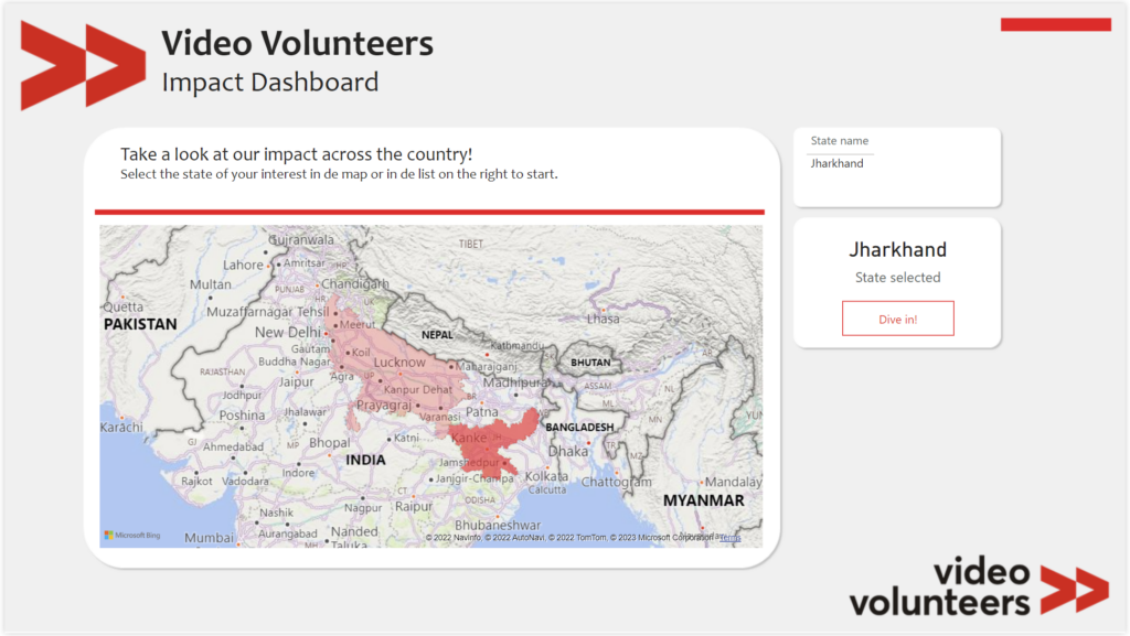
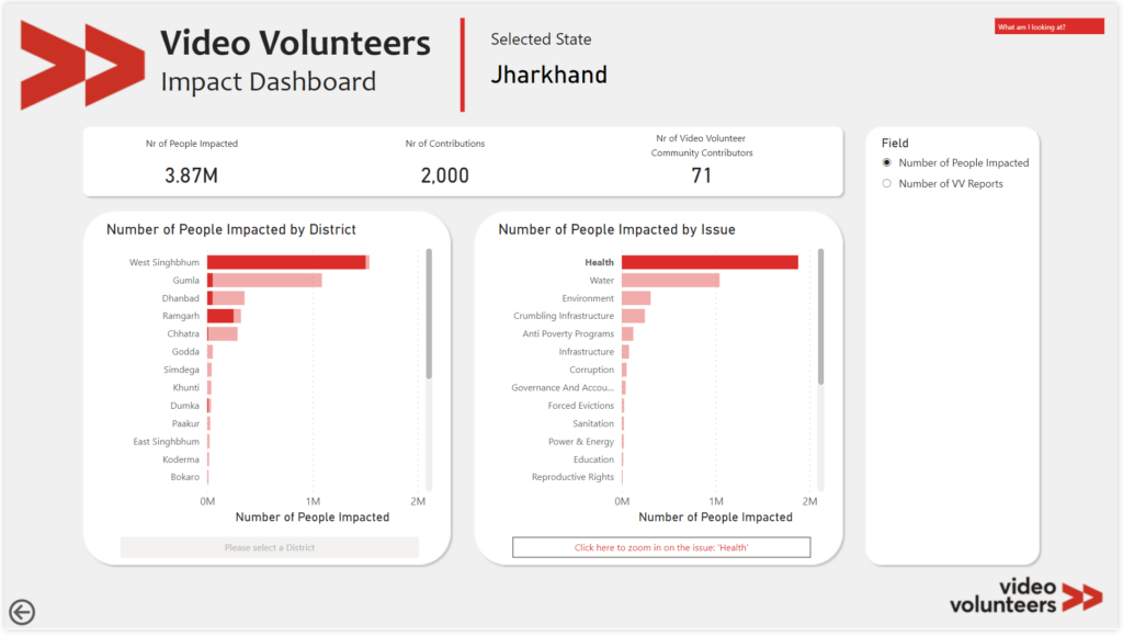
The dashboard has several layers of depth, enabling very detailed views at a district-issue level, while keeping the navigation very simple. On every page, you dive one level deeper. You can also set the metric you want to visualize your data with. Here, I limited this to two core metrics: the number of people impacted by the report and the number of reports issued by Video Volunteer community contributors.
Project kick-off
The project was kicked off mid February with a call between Video Volunteer’s CEO and representatives, Viz For Social Good representatives and the volunteers interested in assisting on the project. It was inspiring to see such a diverse audience spanning the entire globe in location. During the call, the organization was introduced and details were provided on their question: help us use our data (which by the way is very rich and elaborate) to increase our impact. Several questions were raised during the session, amongst which:
“Who is the intended audience of our data stories?”
A very good question, as the audience is where it all starts. The answer was that it could be any of the following.
- The community contributors (“CC” in short, the volunteers that capture the reports and bring them to the government bodies);
- The government representatives; and
- Other organizations (e.g., NGOs) that may be open to collaborating with Video Volunteers.
Getting started
After the session and some thought, I decided to focus my data story on the government representatives. The question I wanted to answer became:
“How can I use this data to compel the government representatives to help the community contributor?”
I imagine a conversation between a CC and a government representative discussing a new issue. How nice would it be if the CC can pull up this dashboard, showcase what impact Video Volunteers have countrywide, and drill all the way through to their local district and show what issues have been resolved and how many people’s lives were positively impacted by the work of the CCs. I wanted the dashboard to help the CC tell this story.
Working the data
The rich dataset we got to work with contained a subset of their official dataset. The data was collected over the course of around 10 years, with improvements made to the data quality of collected data over time. However, for it to be ready for visualization, several data cleansing and preprocessing steps had to be taken. I further split the one dataset into several dimensions and one fact table, building the data model, allowing the filtering and down drilling.
Visualizing the data
Finally, the most important step. After building the data model and preparing the data, I could calculate the measures to be visualized and started thinking about different ways to visualize the data. While also taking other types of visuals into consideration, I chose a map for the home page. Not because it is the most effective way to show which state had the highest number of people impacted, but because I intend the dashboard to be engaging, and inviting to discover ‘your’ story. The map is in this case an effective visual (tip 2 of 5 tips to make your data come alive) to serve this goal.
Throughout the dashboard, I use several bar charts, mostly sorted highest to lowest. The reason for the horizontal charts is that the axis labels often are quite long, which doesn’t go well on vertical charts. Though one could also sort based on alphabetical order to quickly find the district or issue of interest, the high-low sorting allows to showcase areas and issues where impact was high, underscoring Video Volunteers impact.
Tools used & Lessons learned
I developed this dashboard in Power BI, leveraging Power Query and DAX. I recently joined the Power BI User Days in Utrecht and was inspired to try and test a few new things and concepts I had not used before, such as the app-style approach to the dashboard with buttons to drill through, and using the field parameter to set the variable to display. I designed the backgrounds for the dashboard pages in Powerpoint.
I am very happy and proud that I can use my skills and interests to have a social impact in projects like these. The nicest part in my opinion: it is not only an investment in the good cause, I also benefit personally. I learn more about the process, tools and can use the newly gained skills in practice. If you are enthusiastic about data visualization as well, I highly recommend checking out Viz for Social Good and seeing if you can join the next project!
Next Steps
After finishing and sharing the dashboard with the organization, they will select 5 visualizations for which the developer gets to present on March 24. Of course, I hope to be one of those five!
I have also offered to further develop the dashboard in collaboration with representatives from Video Volunteers, to target further efforts efficiently (e.g., more fields/metrics, additional/different views).
About Viz for Social Good
Viz for Social Good is an organization of volunteers that is “the conduit between data enthusiasts and mission-driven organizations who want to make the world a better place”.
Comments are closed